
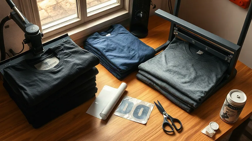
Walk into any print shop that handles a steady stream of streetwear orders and you will eventually spot the same stack of blank tees on the shelf. Heavy, boxy, and dyed in colors that hold their depth after a wash, shaka wear has quietly become a default choice for decorators who care about how a garment feels long after the transfer has cured. This guide is for the printer or small brand owner who wants to understand why that is, and how to get the most out of these blanks when pairing them with direct-to-film output.
There is no single magic fabric. What makes a blank work well with DTF is a combination of weight, weave density, surface texture, and how the manufacturer finishes the goods before they ever reach your press. Get those variables right and your transfers look like they were screen printed at the factory. Get them wrong and you get cracking, dull color, or a plasticky hand feel that customers notice immediately.
What Makes Shaka Wear a Strong Match for DTF
DTF transfers are essentially a printed film of pigment and adhesive that gets heat-pressed onto a garment. The adhesive needs a clean, consistent surface to bond to, and the fabric needs enough structure to hold that bond through repeated laundering. Shaka Wear garments tend to hit that sweet spot because they are built heavy. Many of their tees sit in the 6 to 7 ounce range, and the cotton is combed and ring spun rather than open end, which means fewer stray fibers poking through the print surface.
That density matters more than most people realize. A thin, loosely knit tee lets the adhesive sink into the gaps between yarns, and the transfer ends up bonded to a shifting surface. A denser knit keeps the film sitting on top where it belongs, so the color stays saturated and the edges stay sharp. If you have ever pulled a transfer off a cheap blank after three washes, you already know the difference.
Fabric Options and When to Use Each
Not every order calls for the same substrate. Here is how the common options tend to behave under a DTF press:
- 100% combed cotton: The safest bet for full-color transfers. Smooth surface, predictable press behavior, and excellent color reproduction on light and mid-tone garments.
- Cotton/poly blends: Great for athletic and workwear styles. Slightly lower press temperatures usually work better here, and you should expect a marginally softer hand feel.
- Heavyweight fleece and hoodies: Thicker goods need longer dwell time and firmer pressure to push the adhesive into the pile without flattening it permanently. Pre-pressing is non-negotiable.
- Tri-blend styles: Beautiful drape, but the poly content means you should test a scrap piece before committing a full run. Temperature tolerance varies more between dye lots.
Color Choice Changes Your Artwork Strategy
Shaka Wear's palette leans toward deep, saturated tones, and that is both an opportunity and a constraint. On a black or navy garment, a white underbase is doing most of the visual work, so your transfer needs enough opacity to keep colors from muddying. On lighter garments you can often skip heavy white layers and let the fabric tone interact with the design, which produces a softer result that many customers prefer for vintage-style artwork.
A practical habit: keep a small swatch book of the blanks you actually stock, printed with a standard test file. When a customer asks how a specific color will look, you can show them rather than guess. This single habit has saved more reprints in my experience than any software setting.
Building Your Gang Sheets Around These Blanks
Once you settle on a blank line, the next bottleneck is usually layout. Mixing sizes on a single film saves material, but only if you plan the sheet around the actual garment dimensions you are printing. A DTF Gangsheet Builder makes this far less tedious, because you can drop in artwork at real print size, arrange it against the film width you ordered, and see the waste before you pay for it.
Two layout rules worth internalizing. First, leave a clear margin around every design, usually a quarter inch minimum, so the cutting step does not shave the edge of your artwork. Second, group jobs by garment color. Pressing a run of black tees back to back keeps your platen temperature stable and reduces the fiddling that leads to inconsistent results.
Press Settings That Actually Hold Up
Exact numbers depend on your press, your film, and your powder, so treat these as starting points and dial in from there:
- Pre-press the garment for five to seven seconds to release moisture and flatten the surface.
- Press the transfer at roughly 300 to 320 degrees Fahrenheit for 12 to 15 seconds with medium to firm pressure.
- Peel cold or warm depending on your film type. Cold peel generally gives cleaner edges on detailed artwork.
- Post-press with a cover sheet for five seconds to lock the fibers down and improve wash durability.
The post-press step is the one people skip, and it is the one that most affects how a print survives a laundry cycle. It costs five seconds and it is the difference between a garment that comes back to you and one that does not.
Common Problems and How to Diagnose Them
Edges Lifting After Washing
Almost always an adhesion problem rather than a film problem. Check three things in order: was the garment pre-pressed, was the pressure firm enough across the whole design, and did the garment cool completely before folding? Folding a warm print stacks adhesive against itself and weakens the bond at the edges.
Dull or Muddy Colors
On dark garments, this usually means insufficient white ink density or too short a press time. On light garments, it often means the fabric tone is bleeding through a thin design. Increasing opacity or adding a light underbase solves it, though it will change the hand feel slightly.
Print Feeling Stiff or Rubbery
Excess powder is the usual culprit. Shake off the sheet thoroughly before curing, and make sure your powder application is even rather than heavy in the center. A slightly thinner transfer almost always feels better on a soft cotton tee.
Matching Blanks to Your Customer Base
If you sell to streetwear labels, the boxy, heavier silhouettes in the Shaka Wear range align well with current fits and give your transfers a premium canvas. If you sell to teams, schools, or corporate clients, the same durability advantages apply, but you may want to steer toward lighter weights and softer blends for daily wear comfort. The fabric does not change your artwork. It changes how the finished product is perceived, and perception is what drives reorders.
One last operational note: order a small batch first, print a test run, and wash one sample three times before you commit to a large purchase. Every shop's water, detergent, and dryer settings differ, and a blank that performs beautifully in one facility can behave differently in another. Testing costs a few dollars. Replacing a fifty-piece order costs considerably more.
Frequently Asked Questions
Do Shaka Wear shirts work with DTF transfers without any pretreatment?
Yes, in most cases. DTF does not require a liquid pretreatment the way some other direct printing methods do, but you should always pre-press the garment to remove moisture and wrinkles. Skipping that step is the most common reason transfers fail early.
What is the best Shaka Wear style for a first DTF order?
A mid-weight 100% combed cotton tee is the most forgiving starting point. It handles standard press settings well, shows color accurately, and gives you a clean baseline before you experiment with blends or heavyweight fleece.
How many washes should a DTF print on these blanks survive?
With correct pressing, proper post-pressing, and washing inside out in cold water, a well-applied transfer should hold up for dozens of cycles. Results vary with detergent, dryer heat, and how the garment is worn, so test your own workflow rather than relying on a single number.
Can I mix sizes and designs on one gang sheet?
Absolutely, and it is one of the best ways to control cost. Just keep enough spacing between designs for clean cutting and group your pressing by garment color so your platen temperature stays consistent across the run.
Is it worth stocking multiple blank colors for a small shop?
Start with three or four colors that cover most requests: black, white, and a mid-tone like heather grey or navy. Expand only when you see repeat demand. Overstocking colors ties up cash and leaves you with dye lots that may not match your next order.